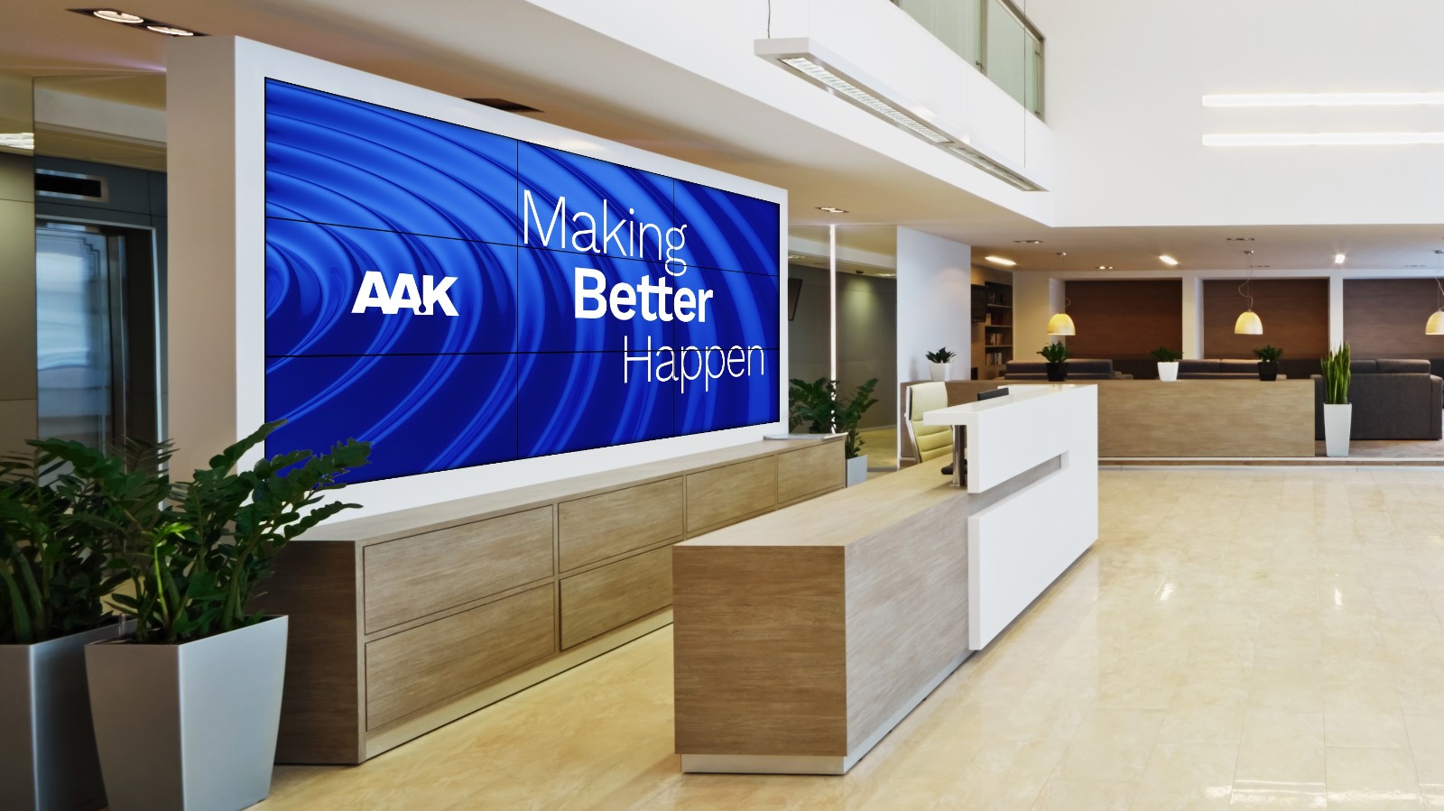
Global oils and fats specialist AAK has unveiled a new corporate purpose – Making Better Happen™. It is the result of an inclusive process involving more than 1,000 AAK employees across the world. At the same time, the company has launched a new visual brand identity that reflects the thinking behind the purpose.
First choice
In 2019, AAK agreed that there was a need for a unifying purpose to facilitate the delivery of the company’s vision to become the first choice for plant-based oil solutions in the sectors where it operates.
During the internal process, involving contributions from more than 1,000 employees, it became clear that AAK’s commercial philosophy is based on the simple goal of doing things better. AAK collaborates closely with its customers to understand what better means for them and how it can deliver on that – for example, by making their products better tasting, healthier, more sustainably sourced and more efficient to produce. Another finding was that AAK’s way of doing business is geared towards making things happen. AAK’s new purpose brings together these two findings – doing better + making things happen – as Making Better Happen™.

Johan Westman, President and CEO at AAK, said: “Our purpose – Making Better Happen™ – is all about the difference we want to make. We choose to be a purpose-driven business in the belief that long-term, sustainable growth goes hand-in-hand with making a positive impact. Central to AAK is a preference for the humbleness of ‘better’ in contrast to the boastfulness of ‘best’. Best breeds complacency, while better is a journey of continuous improvement. In fact, AAK truly believes that better has the potential to be more ambitious than best.”
New visual identity
Making Better Happen™ also inspired AAK to evolve its visual identity. At the heart of the new look is the Better Impact Ripple, which represents AAK’s contribution throughout the whole value chain – from better and more sustainable sourcing to better end-benefits for customers and their brands. The ripples flow outwards, with AAK as their source, communicating that Making Better Happen™ is a journey not a destination. In recognition of the company’s heritage, the AAK logo remains unchanged, as does its long-term association with the color blue.
Johan Westman said: “For our customers, Making Better Happen™ is about enabling them to be successful in a better way by working in close collaboration with us. This is reflected in our continued commitment to be the Co-Development Company.”


