
 Login/Register
 Supplier Login


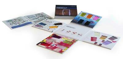
Clariant has released ColorForward® 2017, the 11th annual color forecasting guide for the plastics industry. The 2017 guide visualizes trends like data mining, growing social disconnection and the search for more meaningful lives.
The latest edition of ColorForward is very different from the 2016 edition released a year ago, according to Judith van Vliet, ColorWorks Designer at ColorWorks Europe, Merate, Italy. The mood reflects a bit more fearful, more introspective and reflecting the disconnectedness that many people seem to be feeling today. With some exceptions, the colors are more muted, softer, darker and even ambiguous in general.
Each of the trend themes is represented by a palette of five colors. These are not intended to predict the “next hot color,” however. Instead, they are presented to Clariant customers as a creative experience. For some, the trend themes and color palettes offer inspiration while, for others, they serve as confirmation of what they already think and see.
The trend name: ANNOY FIRM OMIT is an anagram of the phrase “my information” and it is intended to capture the ambiguous, yin/yang nature of the information universe. Data mining, or the systematic sifting of digital information to achieve a specific purpose, is central to this trend theme. The duality of the web-world is captured in the annoy firm omit trend colors. Two of the five are dark and sinister.
The trend: DELONELINATION reflects the last taboo in a connected world, which is being lonely. Delonelination is a wake-up call, a warning that loneliness is on the rise, particularly among young people. The five colors representing this trend are generally pale and muted, ranging from a beige to suggest the human need to be handled with care, to a plain brown.
The theme NEBULOVE could almost be seen as the antithesis of loneliness because it recognizes a trend toward complex connected relationships between multiple people who may be married or not depending on what gives them fulfillment. Colors representing this theme are a light green/yellow like the inside of a cucumber, and a diffuse red. There is a lilac purple and a brownish orange, almost cognac-colored shade. A deep soft pink color called Perky Star is used to represent the “happy single.”
The trend: IT’S A TRAP! is reflective of life that can be a trap. It can be hard and stressful – or just plain dull – if you allow it to become that way, and so people are beginning to seek new ways to break out, to be curious and explore the limits of the human mind. This trend is about escapism and finding new modes of perception.” Not surprisingly, the colors of this trend theme tend toward a funky new aesthetic.
NIKE SB